Tablet App
Noak Clinic Dashboard

Overview
During my time at Noak, I was responsible for designing the Left-side interface of the Patient Medical Record feature for the clinic dashboard app, enabling users to quickly access detailed medical records.
I collaborated closely with cross-functional teams (Engineering, CEO, and Design Lead) to ensure seamless integration and design approval, in preparation for a public release later this year.
Role
Product Designer
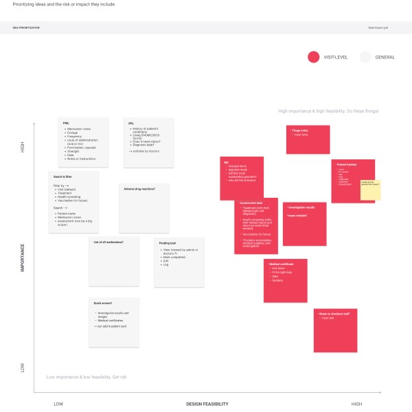
User researching
When
Sep 2024
Background
Kickoff
Approach
Researching the process

From the start, we designed with a module-based approach.
My first attempt
The "Weird Beginning" – Embracing First Drafts
Every great designer starts somewhere, and for me, it began with a design that was... let’s just say, unconventional.
While working on the interface, I focused on the two cards that are likely to have the most significant usability issues: the patient medication list and the patient problem list. The initial design was cluttered and hard to read, with overflowing text and no clear focus, making it difficult for users to quickly find key details like diagnosis names or dates. The poorly placed edit icon further added to the confusion. By addressing these challenges, I was able to create a more intuitive and user-friendly experience, with plans to refine the rest of the interface in future iterations.

The original design that i came up for the patient medication list and problem list
Internal feedback
I sent out a survey to our teammates and the CEO to gather feedback on what could be added or removed from our dashboard. The goal was to identify quick wins—simple improvements that can be implemented efficiently
Some of the feedback i got were
Everything feels like it’s on the same level. It’s hard to figure out what’s the most important part of the screen
Showing all the data upfront can overwhelm the doctors or staff.
Need to define whether we use the

Iterate, iterate, iterate
After gathering feedback and analyzing the issues, I focused on simplifying the design to create an MVP (Minimum Viable Product) version that prioritizes usability and clarity.
Improve the patient problem list
This redesign aimed to enhance the user experience of the Patient Problem List by organizing the information for better readability, accessibility, and overall usability.
Key improvements made:
Streamlined Display: Simplified long diagnosis names for easier reading and emphasized key details.
Enhanced Readability: Improved alignment and grouping for a cleaner layout and reduced clutter.
Clear Data Presentation: Added clear labels for creation and edit dates and used placeholders for dynamic fields.
User-Friendly Design: Removed extra icons and used a high-contrast background for better focus.
Better Scalability: Added a "View more" option for longer lists, making it easier to manage.

Improve the patient medication list
Key improvements include:
Better Information Organization: Separated start and end dates into distinct fields for easier identification.
Clearer Layout: Labeled optional fields to avoid confusion and highlight mandatory ones.
Enhanced Readability: Improved alignment, spacing, and grouping for a more intuitive interface.
Visual Focus: Used distinct styling to highlight key details like medication status and brand name.
Less Clutter: Removed repetitions and reorganized sections for a cleaner look.
Clean Interface: Eliminated extra edit icons to keep the design simple.
Improved Scalability: Introduced a "View more" option to manage long lists without overwhelming the user.

The MVP


Thank You For Reading !!